
Page 12 - Spirit_Summer2021
P. 12
“One of the things that really stood out in Atomicdust’s
proposal was the depth of research they would conduct,”
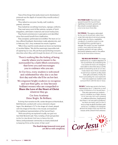
Samel said. THE UPWARD SLANT: The words slant
They talked to everyone: faculty, staff, students, upward toward the Sacred Heart,
parents, alumnae. signifying movement, growth and
They looked at everything: brochures, signage, uniforms. the school’s constant desire to
strive to be more Christ-like.
They read every word of the website, samples of Spirit
magazines, admissions materials and social media posts.
They found consistencies in perception and identified THE TYPEFACE: The agency advocated
areas that would benefit from clarification. for the use of a block font, rather than
script. Not only does it stand out among
They analyzed, synthesized and drafted. The team at Cor school logos, but from a readability
Jesu offered feedback, Atomicdust made adjustments, and standpoint, it would be easier to scale
in February 2021, they reviewed the results together. for anything from a pocket logo to
“When they read the words aloud, we knew we had done signage. The words “Cor Jesu” maintain
it,” recalled Weber. “We did the seemingly impossible task a softer, more italicized look, while
Academy, printed in all caps, reflects
of capturing Cor Jesu. We put that special feeling everyone the historic lettering used on the yellow
describes when they walk through the doors of CJ into words. brick by the front tower entrance.
There’s nothing like the feeling of being THE CROSS AND THE HEART: The image
exactly where you’re meant to be, itself serves as a modern depiction of
the Sacred Heart. By embedding the
surrounded by a faith-filled community
COR JESU REBRAND At Cor Jesu, every student is welcomed center of everything we do at Cor Jesu.
cross inside the heart, the designers
that loves you and encourages
were able to show that Jesus is at the
you to embrace who you are.
It also shows how Christ is revealed
in each of our students as they share
and celebrated for who she is on her
their gifts and talents. Finally, the
heart surrounding the cross represents
first day and who she’ll be on her last.
how we support our students and
We empower bright students to recognize
surround them with the love of Jesus.
and use their gifts, so they become
brilliant women who are compelled to THE RAYS: Twelve rays encircle the heart,
Share the Love of the Heart of Christ representing Jesus’ 12 Apostles, as well
as the 12 Promises of the Sacred Heart.
wherever they go. They also represent our students –
Cor Jesu Academy each as a brilliant ray of light, shining
in her own way. Each ray is pointing
Shine Bright. Be Brilliant. in a different direction, emphasizing
that there is not one path to brilliance,
To bring that narrative to life, senior designer at Atomicdust, but there are many, and Cor Jesu is
Beth Bennett, worked with various elements of past here to help students find their path
logos. She sketched a “CJ” in the shape of a heart, played and shine. In addition, the designers
with the shape of the tiles in the mosaic and explored derived the shape of the rays from the
the traditional representations of the Sacred Heart. mosaic at the school’s front entrance.
“With everything we explored visually, our goal was
two-fold,” Bennett said. “One, to bring a fresh perspective
to the Cor Jesu brand. And two, to honor the rich
history and passionate community so clearly dedicated
to keeping Christ at the center of their work.”
The final design honored every goal,
yet did so with simplicity.
10 Spirit Magazine SUMMER 2021