
Page 13 - Spirit_Summer2021
P. 13
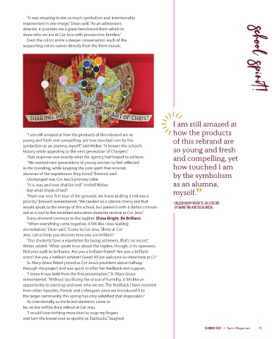
“It was amazing to see so much symbolism and intentionality
            represented in one image,” Dean said. “As an admissions
            director, it provides me a great benchmark from which to
            share who we are at Cor Jesu with prospective families.”
              Even the colors invite a deeper conversation: each of the
            supporting colors comes directly from the front mosaic.                                                    school spirit!


                                                                                  I am still amazed at

              “I am still amazed at how the products of this rebrand are so       how the products
            young and fresh and compelling, yet how touched I am by the           of this rebrand are
            symbolism as an alumna, myself,” said Weber. “It honors the school’s
            history while appealing to the next generation of Chargers.”          so young and fresh
              That response was exactly what the agency had hoped to achieve.     and compelling, yet
              “We wanted new generations of young women to feel reflected
            in the branding, while keeping the core spirit that reminds           how touched I am
            alumnae of the experiences they loved,” Bennett said.                 by the symbolism
              Unchanged was Cor Jesu’s primary color.
              “It is, was and ever shall be red!” smiled Weber.                   as an alumna,
              But what shade of red?                                              myself.    ”
              “From our very first tour of the grounds, we knew picking a red was a
            priority,” Bennett remembered. “We landed on a vibrant cherry red that   –COLLEEN BARRY WEBER '11, CJA DIRECTOR
            would speak to the energy of the school, but paired it with a darker crimson      OF MARKETING AND SOCIAL MEDIA,
            red as a nod to the excellent education students receive at Cor Jesu.”
              Every element connects to the tagline: Shine Bright. Be Brilliant.
              “When everything came together, it felt like I was reading
            an invitation,” Dean said. “Come to Cor Jesu. Shine at Cor
            Jesu. Let us help you discover how you are brilliant.”
              “Our students have a reputation for being achievers, that’s no secret,”
            Weber added. “What spoke to us about this tagline, though, is its openness.
            Pick your path to brilliance. Are you a brilliant friend? Are you a brilliant
            artist? Are you a brilliant athlete? Great! All are welcome to shine here at CJ.”
              Sr. Mary Grace Walsh joined as Cor Jesu’s president about halfway
            through the project and was quick to offer her feedback and support.
              “I knew it was bold from the first presentation,” Sr. Mary Grace
            remembered. “Without sacrificing the virtue of humility, it felt like an
            opportunity to stand up and own who we are. The feedback I have received
            from other Apostles, friends and colleagues since we introduced it to
            the larger community this spring has only solidified that impression.”
              As intentionally as the brand elements came to
            be, so too will be their rollout at Cor Jesu.
              “I would love nothing more than to snap my fingers
            and turn the brand over as quickly as Starbucks,” laughed

                                                                                                 SUMMER 2021  Spirit Magazine  11